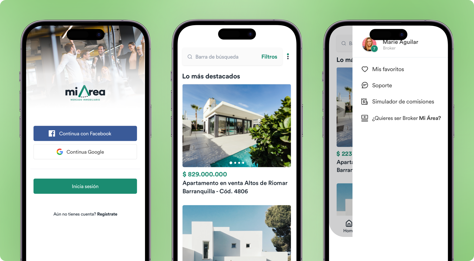

When I start every project, it always is necessary for the flow of the product, it gives a better conception of all screen that I require to design, for example, the first option is login on my brain i know what I need to design.
PROJECT NAME
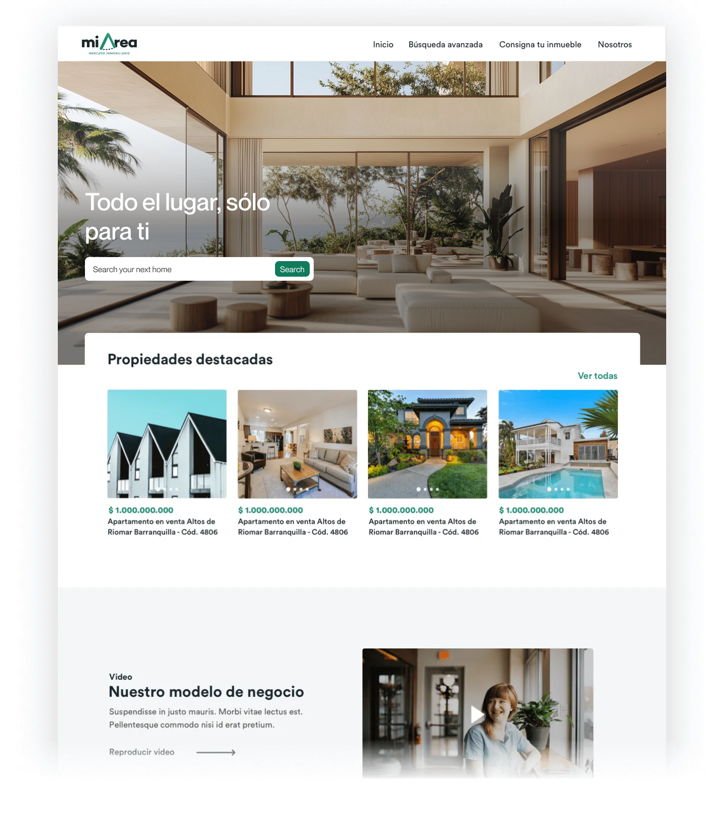
Connecting buyers and sellers, a user-friendly app revolutionizes real estate in the Mi Area.
INTRODUCTION
It's app that is completely changing the way the real estate market works. The app uses the exact location of properties to provide results instantly.