
This the comparison between the started version with the final design.
PROJECT NAME
K&K Insurance pioneers insurance for Indiana's motorsports scene.
INTRODUCTION
Is an insurance company for coverage motorsports.
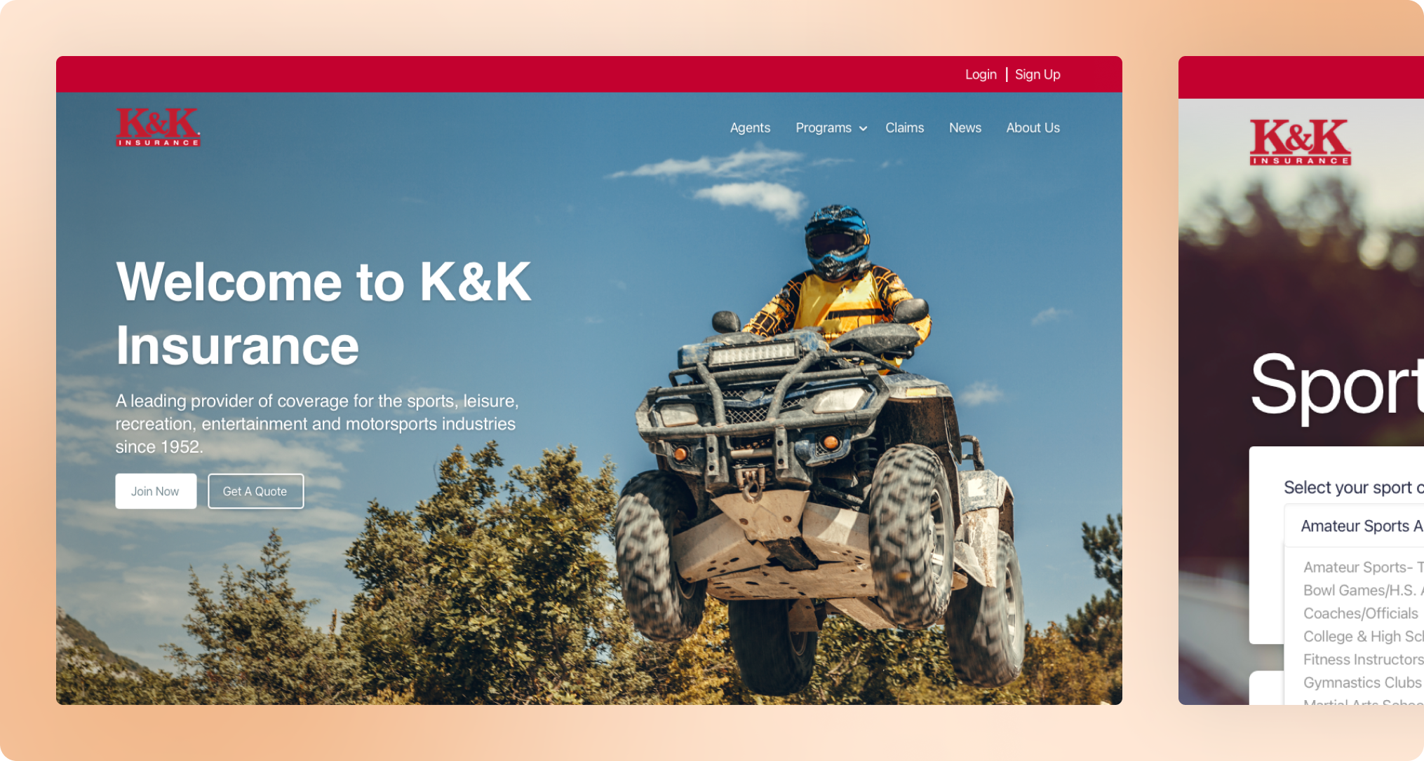
K&K Insurance pioneers insurance for Indiana's motorsports scene.
Is an insurance company for coverage motorsports.
"Landing page redesign"
Improve the efficiency of the truck tracking process. This could be done by making the platform easier to use, reducing the number of clicks required to complete an action, and providing more data about the trucks.
Low fidelity wireframes, benchmarking, visual design.
UI/UX Designer
Web
I identified the following problems with the website:
Studies have shown that users are overwhelmed by too much information on a page. This can lead to confusion and frustration.
The image on the homepage is too small to give users a clear sense of what the website is about.
The categories in the navigation menu are repeated. This can be confusing for users.
There are too many items in the navigation menu. This can make it difficult for users to find what they are looking for.
The login/register button is in a place where it can be easily missed. This can be frustrating for users who want to sign up for the website.
The texts on the website are not organized in a way that makes it easy for users to scan and understand. This can make it difficult for users to find the information they are looking for.

This the comparison between the started version with the final design.


