PROJECT NAME

Liberty Puerto Rico

INTRODUCTION

Liberty Puerto Rico is a telecommunications company that is looking to improve its e-commerce platform in order to increase sales. The company is proposing a new design that will be more visually appealing, easier to use.

"Launch a new e-commerce platform with a refreshed brand identity to increase sales by 21%"

Goal

The goal of the new e-commerce platform is to become the leading telecommunications provider in Puerto Rico by attracting new customers and increasing sales.

WHAT DID I DO?

Data analysis, User flows, Information Architecture, Low Fidelity Wireframes, Visual Design, Design System.

ROLE

UX/UI Designer

PLATFORM

Web desktop and responsive

PROBLEMS

In collaboration with the analytics team, we identified three key areas where we can improve the shopping experience:

High shopping cart abandonment rate

Currently 60% of customers abandon their carts before completing a purchase. This can be caused by a variety of factors, such as a complex checkout process, high shipping costs, or a lack of trust in the website.

Low conversion rate

Currently only 30% of visitors to our website make a purchase. This can be affected by a number of factors, such as the quality of the website design, the relevance of the products to the target audience, and the effectiveness of the marketing campaigns.

FIRST STEPS

We're going to start by designing a new shopping experience that takes into account the entire purchasing process, from the moment a user first sees an ad to the moment they make a purchase. We'll test our design with users to make sure it's effective, and then we'll implement it on our website.

Bench

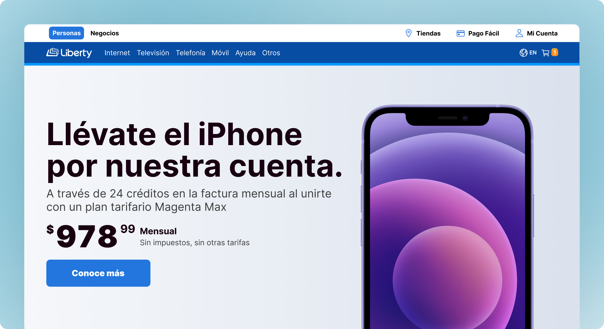
I made a benchmark and I get as a result three key improvements that we can implement in the new e-commerce platform:
Make the website more visually appealing by using high-quality images to showcase the products and services offered.
Use clear and concise language that is easy to understand.
Make the navigation easy to use by organizing the website in a logical way and using clear labels.

Diagram

During this phase, it's essential to establish a workflow to gain a clear understanding of our design objectives. This involves meetings with Product Owners, market experts, and business analysts to gather all the necessary requirements to create the designs.

diagram
banner

I designed hero banners using the design system, following its specifications for grid layout, breakpoints, typography, and buttons. My responsibilities included UI design, selecting colors, arranging images, and maintaining brand consistency. These banners aimed to attract attention and provide informative content.
They successfully promoted various products and services, leading to increased brand visibility and sales.

banner

The website had too many sections, so a main menu was necessary. I designed a new proposal for the menu that was scalable in terms of item display, it can be adapted to accommodate a growing number of sections. This is important because the website is expected to continue to grow in the future.

banner

The product listing page (PLP) is where the majority of traffic to an e-commerce website comes from. It is typically a grid of product cards, each of which contains a product name, price, and other relevant information related to the plans, The product display is simplified for easy reading.

PDP

The product detail page (PDP) allows users to configure their plan by adding additional items such as a WiFi extender, TV box, additional channels, and insurance, etc.
This gives users the flexibility to customize their plan to meet their individual needs.The PDP is a critical part of the e-commerce experience, as it is where users make their final decision about whether or not to purchase a product. By providing users with the ability to configure their plan, businesses can increase the likelihood of a sale.

Location

The shipping address section is part of the checkout process. Users must confirm the address where their product will be delivered. This information is collected from the market. By providing accurate shipping information, users can help to ensure that their order is delivered on time.

Mobile

When I design the mobile views for the e-commerce platform, we carefully considered the market's breakpoints as indicated by the analytics tool.

font

I define a scale of typography using H1, H2, H3, H4, and H5 headers. Additionally, we ensure that all typography is implemented as tokens, making it easy to consume and rapidly build screens. This approach enhances consistency and efficiency throughout the design process.

2
DS
System

The brand just have define the primary colors, the rest of the scale focus on accessibility and ease of use. Through them The scales are divided into 10 levels: the colors from 10 to 40 have a contrasting warranty of > 4.5:1 in white backgrounds, while the ones from 70 to 100 have the same warranty in dark backgrounds. In this way, our components respect the adequate contrast proportions for textual and interactive elements and non-interactive elements, in accordance with any palette.

Impact

During the first three months, we view a series of results on the e-commerce platform. All of this information was delivered by the data analysis team.

load

load pages

The average load time for pages on the website was reduced by 20%.

click

number of clicks

The number of clicks required to complete a task was reduced by 15%.

User

overall satisfaction

The overall satisfaction of users with the website increased by 40%.

25 %

App download

The app download rate for the website is 25%, which is lower than we would like.

67 %

Mobile navigation

The majority of users 67% are navigating the website from mobile devices, so it is important to optimize the website for mobile devices.

21 %

Conversion rate

Conversion rate: "The conversion rate for the website was 21%, which is a good start but there is room for improvement.

Let's jump into another projects

Insurance

Mi Área

Real state app

Read case study
Dash

Cargo App

Tracking trucks dashboard.

Read case study
Insurance

K and K Insurance

Sports insurance website

Read case study