

Was necessary create Sitemaps to have a better and clear view of this project..
PROJECT NAME
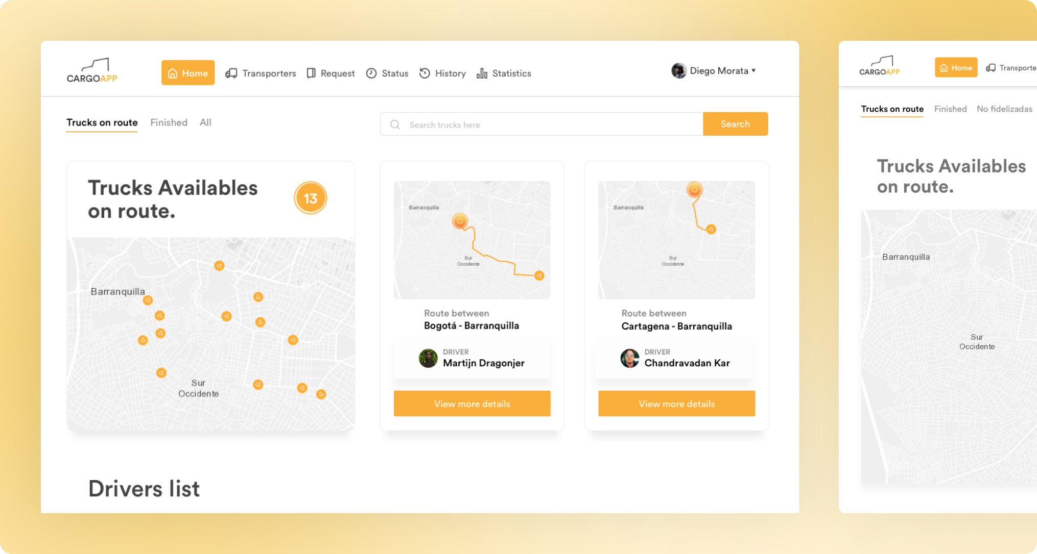
Truck tracking, Cargo App dashboard improves operational efficiency.
INTRODUCTION
This platform enables a company to track the location of their trucks, providing more efficient time management for administrators.


